Widget customization
Widget customization
Configure the widget's content, style, behavior, and languages with a live preview of what customers will see.
Everything about how the widget reads, looks, and acts lives at Channels → Website Widget, in three tabs: Content, Style, and Behavior. The right side of the page is a live preview that updates as you type; a floating save bar appears whenever you have unsaved changes. The same configuration drives the floating widget, the inline embed, and the hosted Chat Page.
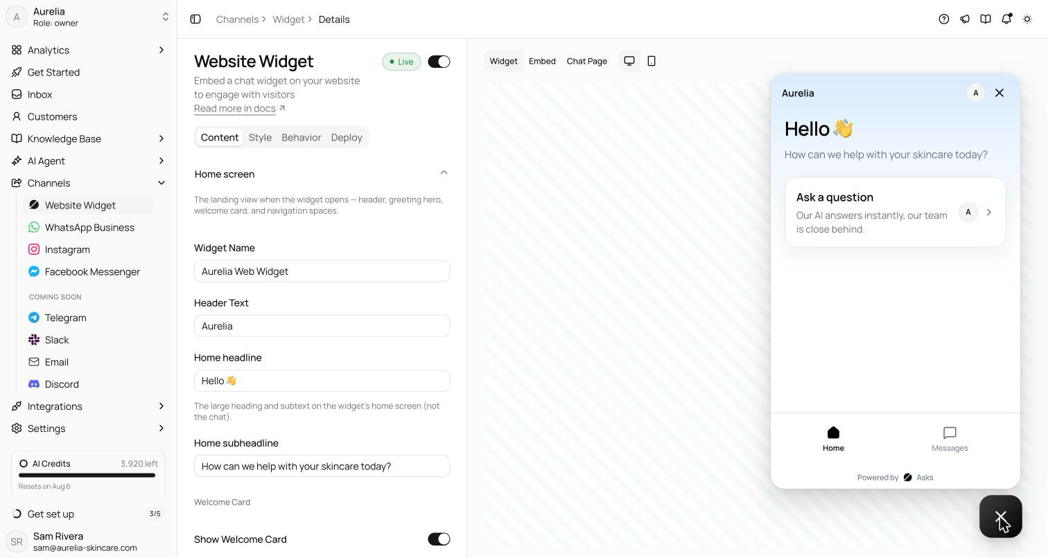
The three tabs
Content
Every piece of text a visitor reads, grouped by the surface it appears on. Opening a section jumps the live preview to the matching view, so you always see what you're editing.
| Section | Settings |
|---|---|
| Home screen | Widget name; header text (leave empty to show your logo); the home headline and subheadline; the Welcome Card — show or hide it, and set its title and subtitle; Spaces — whether the widget offers the Home and Messages views |
| Conversation | Chat opening message (the first message the AI sends); conversation starters — up to 5 click-to-send prompts, reorderable, with a Keep showing after first message toggle; message input placeholder; Footer & disclaimer — a footer line (for example a reply-time expectation) and a dismissible one-time notice at the top of the chat |
| Launcher teaser | A small message bubble next to the closed launcher: show or hide it, its text (leave empty to reuse the chat opening message), and a delay in seconds after page load |
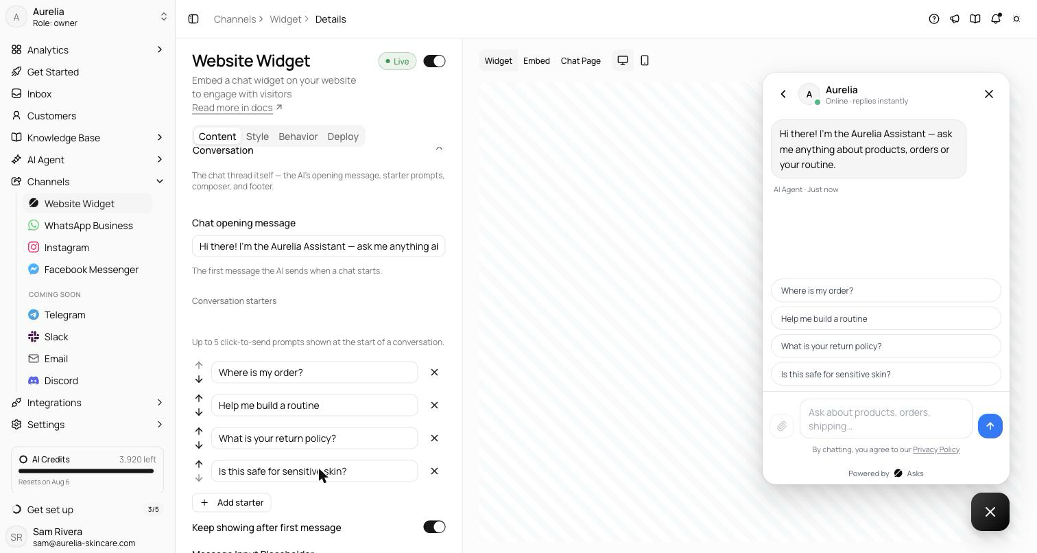
Style
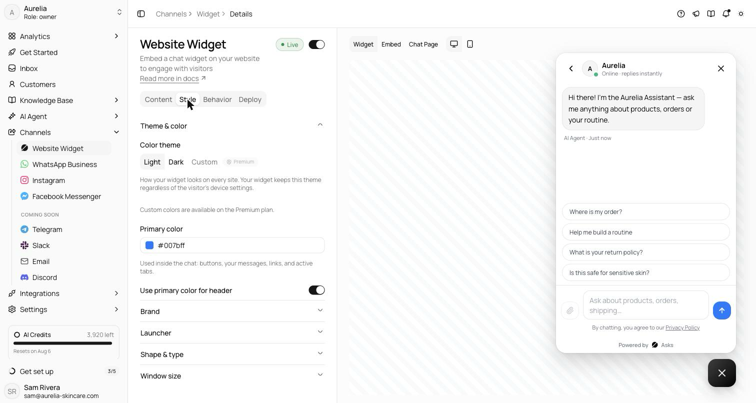
How the widget looks, from theme to launcher:
- Color theme — Light, Dark, or Custom Premium. The widget keeps your saved theme regardless of the visitor's device settings. Custom unlocks per-token colors — surfaces (background, card, AI message bubble, border), text (primary, secondary, link), accent text, and input colors — each with a contrast warning when a pair falls below the WCAG AA ratio of 4.5:1.
- Primary color — your accent, used inside the chat for buttons, your messages, links, and active tabs. A warning appears if the color is too light to read on white. A separate toggle applies it to the header.
- Profile picture — JPG, PNG, or SVG up to 1MB; defaults to your workspace logo.
- Branding Premium — a Show Branding switch and a Remove Asks branding switch control the "Powered by Asks" mark.
- Launcher — the floating button always uses your primary color, and shows the Asks mark by default. Upload your own launcher icon to replace it (square images with a transparent background work best — PNG or SVG, up to 1MB), and set the size (Small, Input only, or Classic) and position (right or left).
- Shape & type — roundness (S / M / L / Full) and text size (Small / Medium / Large).
- Window size — max width 320–640px and max height 400–800px, used by both the floating window and the inline embed.
Behavior
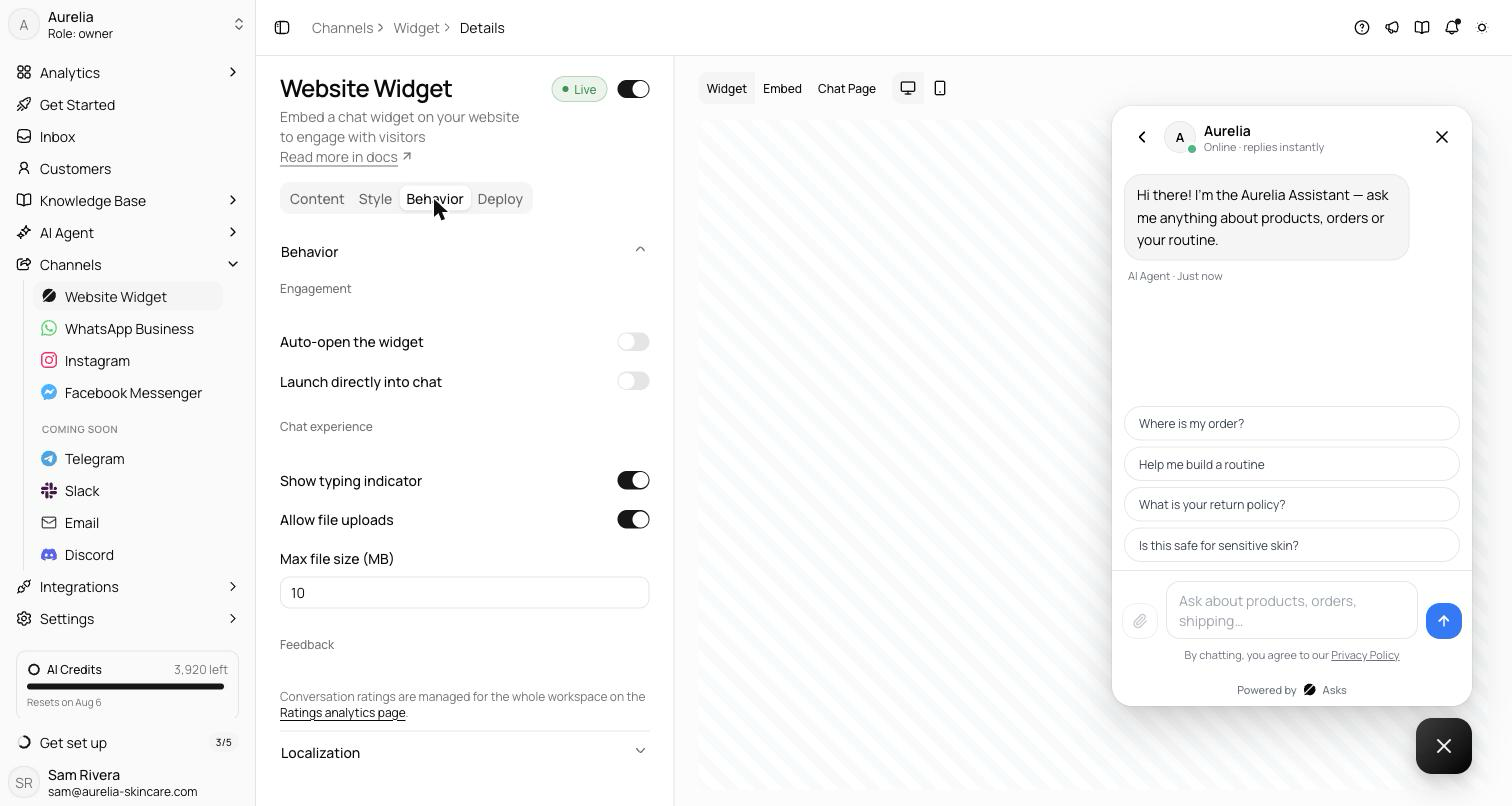
How the widget acts during a visit, in three groups:
- Engagement — Auto-open the widget on page load, with an optional delay in seconds, and Launch directly into chat to skip the home screen.
- Chat experience — Show typing indicator while a reply is being written, and Allow file uploads with a configurable max file size in MB (10 by default; up to 10 files per message).
- Feedback — end-of-chat ratings are a workspace-level setting, not a widget one. The tab links to the Ratings analytics page, where one toggle covers every channel; see Analytics → Ratings.
Localization
The Behavior tab also carries Localization — the language of the widget chrome: buttons, labels, timestamps, and system messages. Pick a default language and add any of eight: English, Spanish, Portuguese, French, German, Italian, Dutch, and Indonesian. When a visitor's browser language matches a language you've enabled, the widget displays in it; otherwise it uses your default.
Your own content — the opening message, starters, and titles — is never machine-translated; only the built-in chrome switches language. The setting applies to the floating widget, the inline embed, and the Chat Page alike.
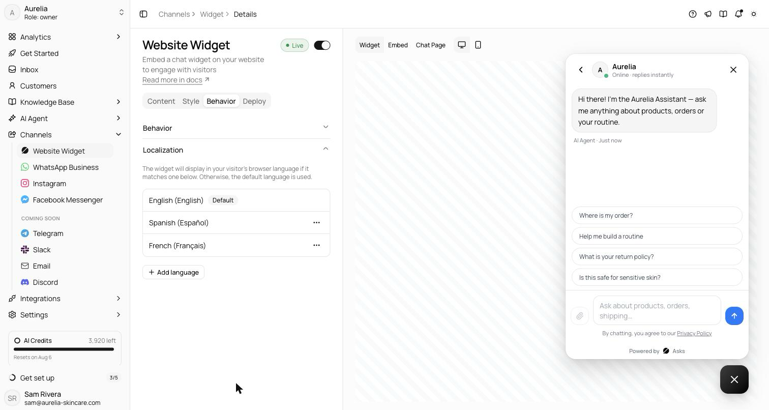
The live preview is exactly what customers will see — switch it between the widget, embed, and Chat Page surfaces, and between desktop and mobile, before you save. With a Shopify store connected, the preview locks to the floating widget, since your storefront is the only install target.
Related
- Website widget — install the widget on your site.
- Chat Page — the hosted surface that shares this configuration.
- Analytics → Ratings — the workspace-level rating setting and where ratings land.